
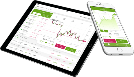
Forex4you Mobile
Forex4you is shaking up the world of mobile trading with our revolutionary app. Simple to use, with all the features you need.
Learn more
Forex4you is shaking up the world of mobile trading with our revolutionary app. Simple to use, with all the features you need.
Learn more
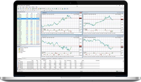
This is the most popular professional Forex trading software available, with outstanding tools & features for trading and conducting market analysis.
Learn more
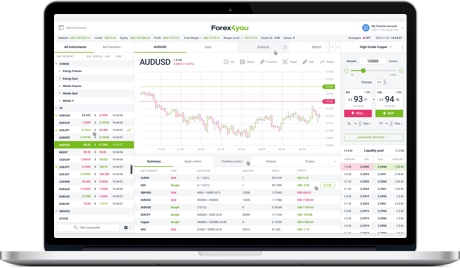
This is a unique and full-featured Forex trading web-based platform with a user-friendly interface.
Learn more
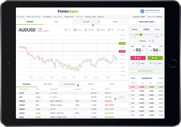
Our Forex trading installable platform for Windows and MacOS comes with a user-friendly interface.
Learn more